Brand Identity & Visual Direction for the ‘Reifler Jean’
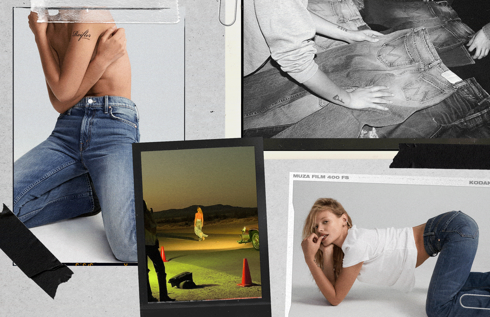
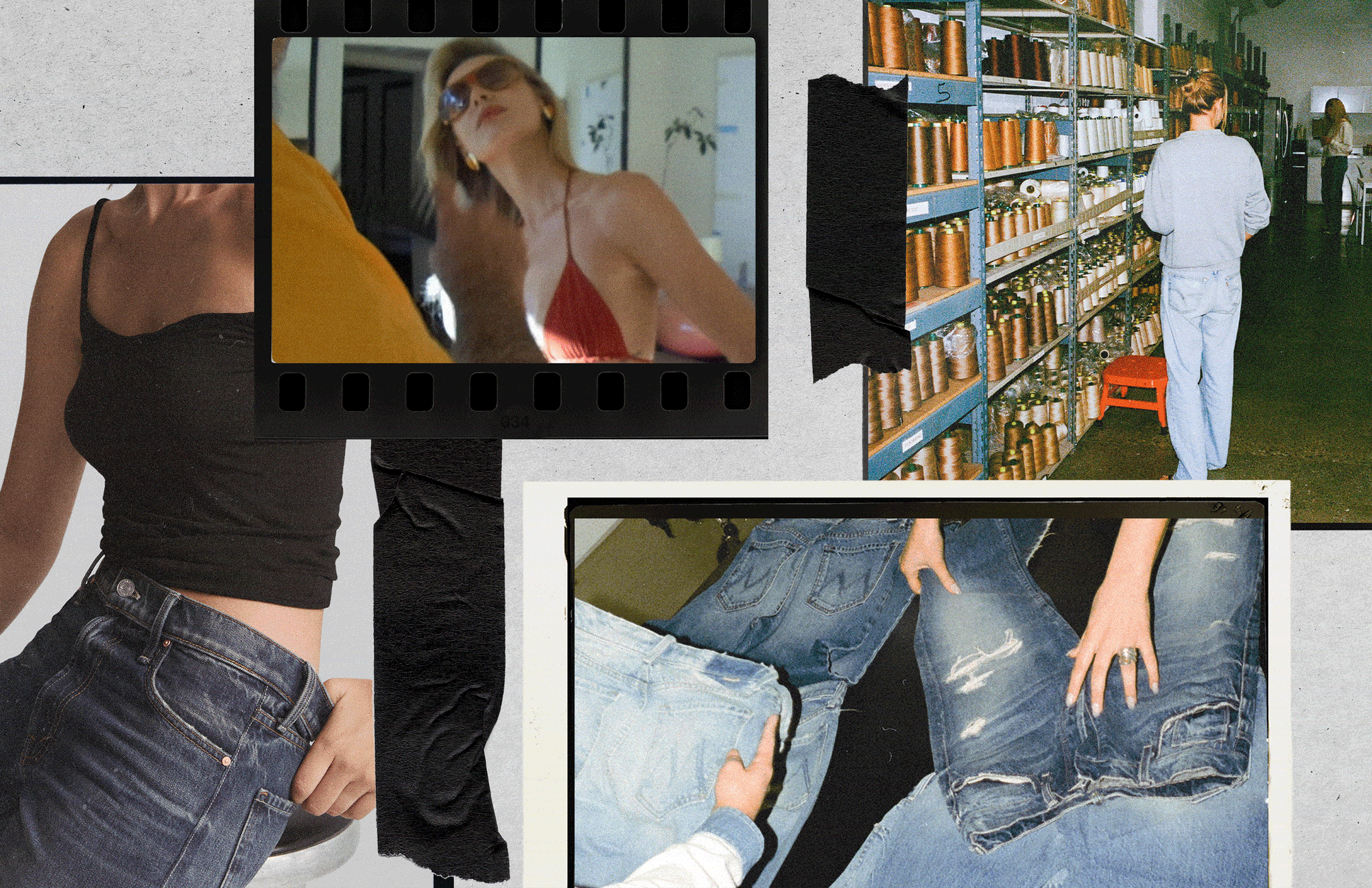
Originally conceived by Paige Reifler as a love letter to vintage denim, The Reifler Jean was developed in collaboration with MOTHER. Brought on early to help shape the creative, Kelsey led the visual identity—from pitch decks and moodboards to logo, color, and illustration—along with art direction for the campaign and website, capturing the capsule’s irreverent, referential spirit.
www.motherdenim.com/collections/reifler
-
Concept Deck & Moodboards
Visual identity (Logo, Color, Type)
Illustrations
Marketing collateral
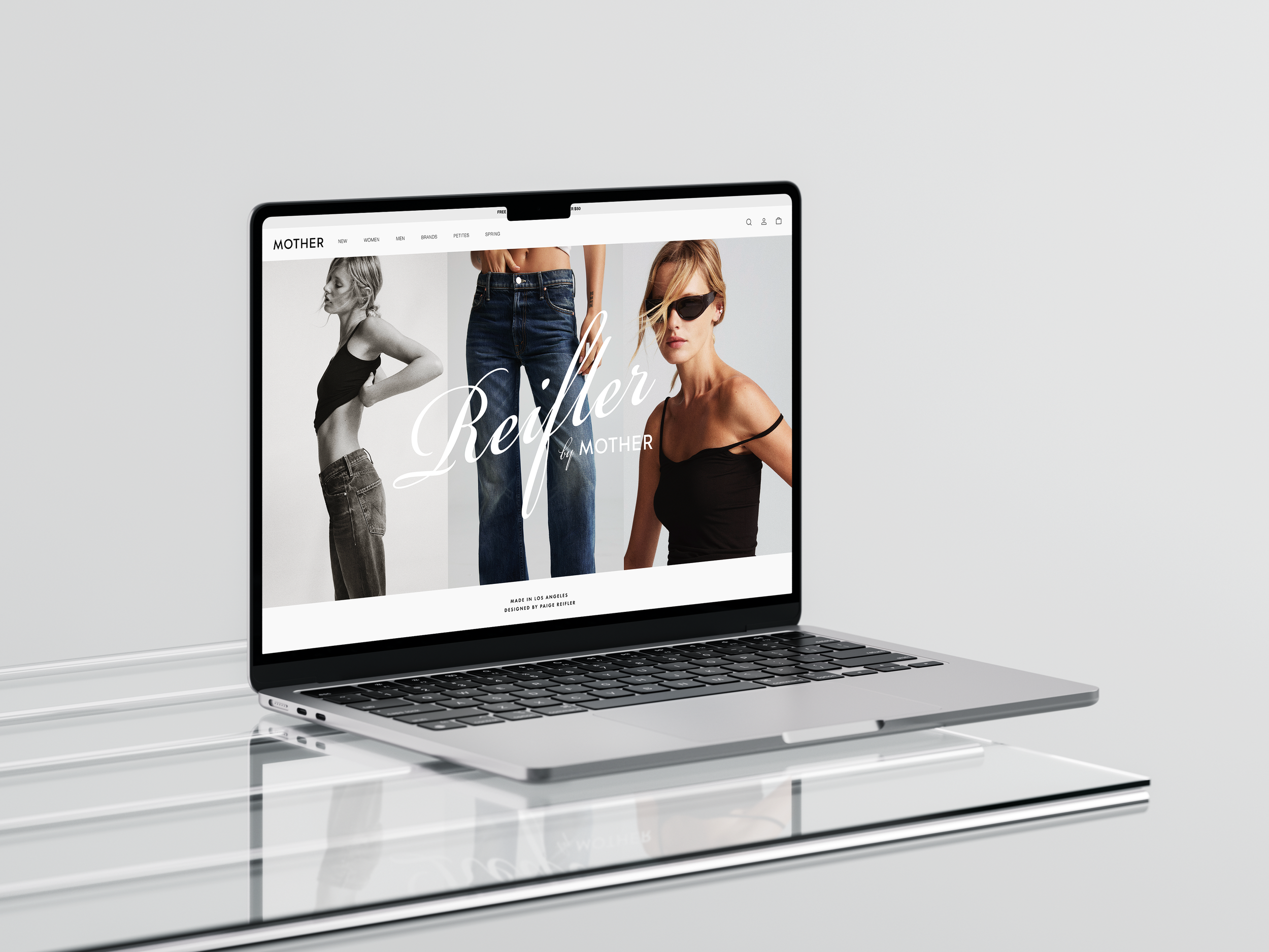
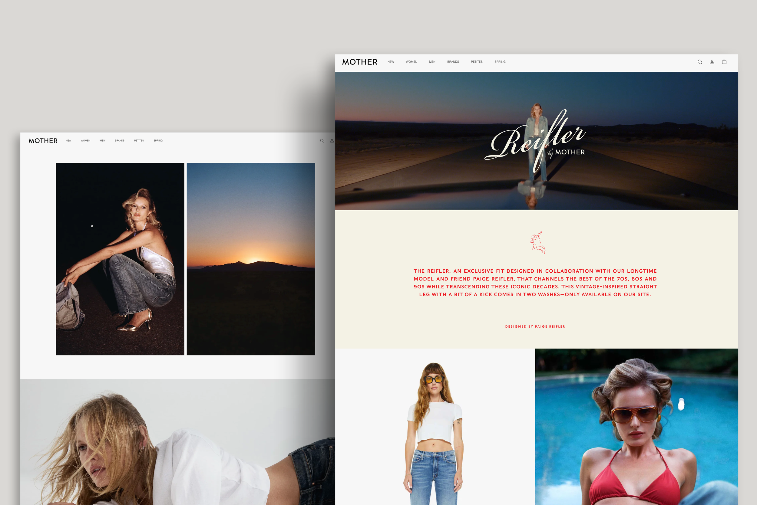
Website Art Direction
-
Photo: Rebekah Campbell
Director: Max Olson
CD: Paige Reifler
DP: Audrey Biche
Production: Corinne at North 6th
Production Design: Julie Faravel
Hair: Riad Azar
Makeup: Katie Mann
Agent: Autumn Cannella Rebasti
Brand: Mother Denim
The Creative
The visual world drew on vintage denim culture, nostalgic film references, and a mix of global and personal influences:
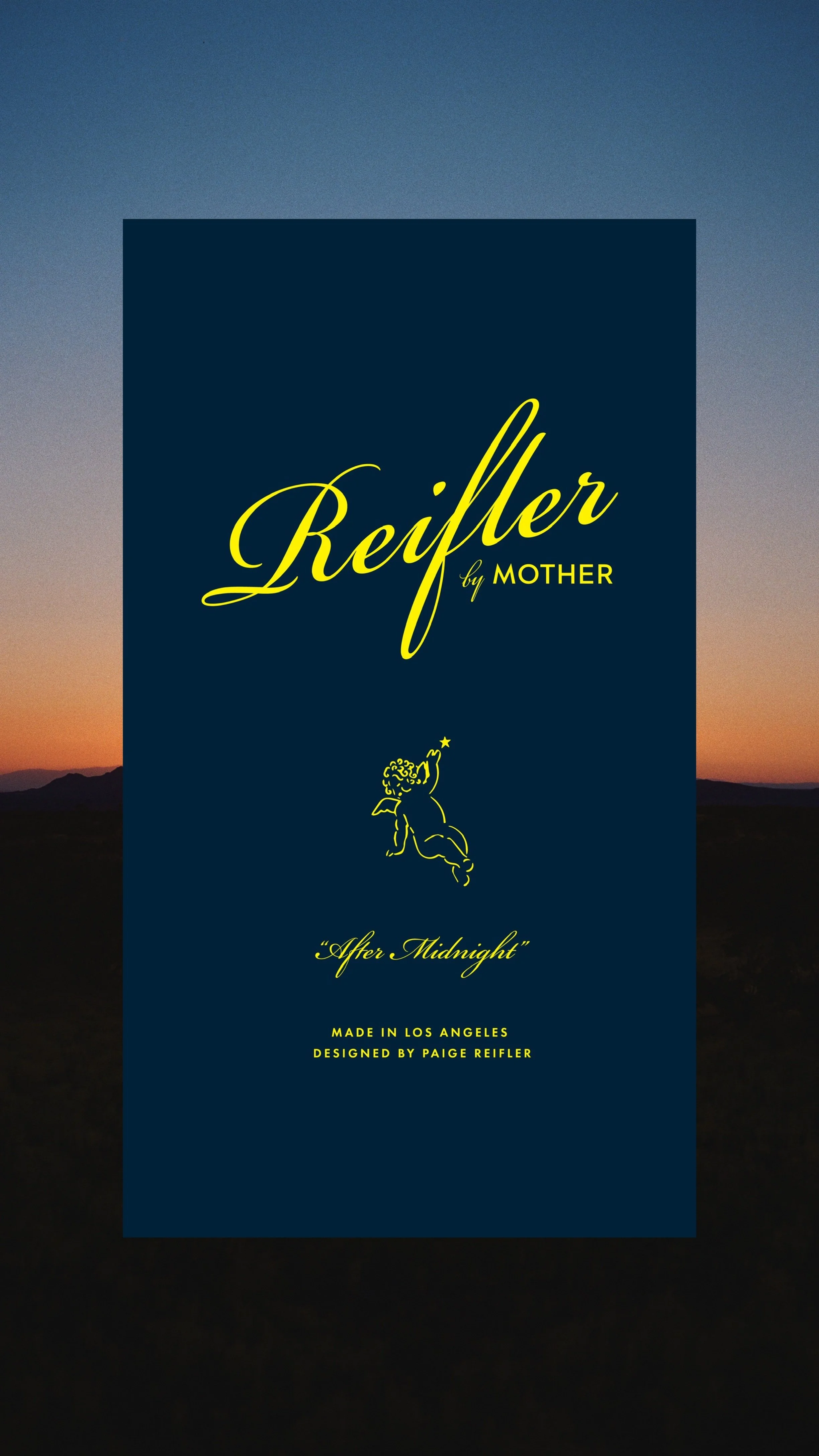
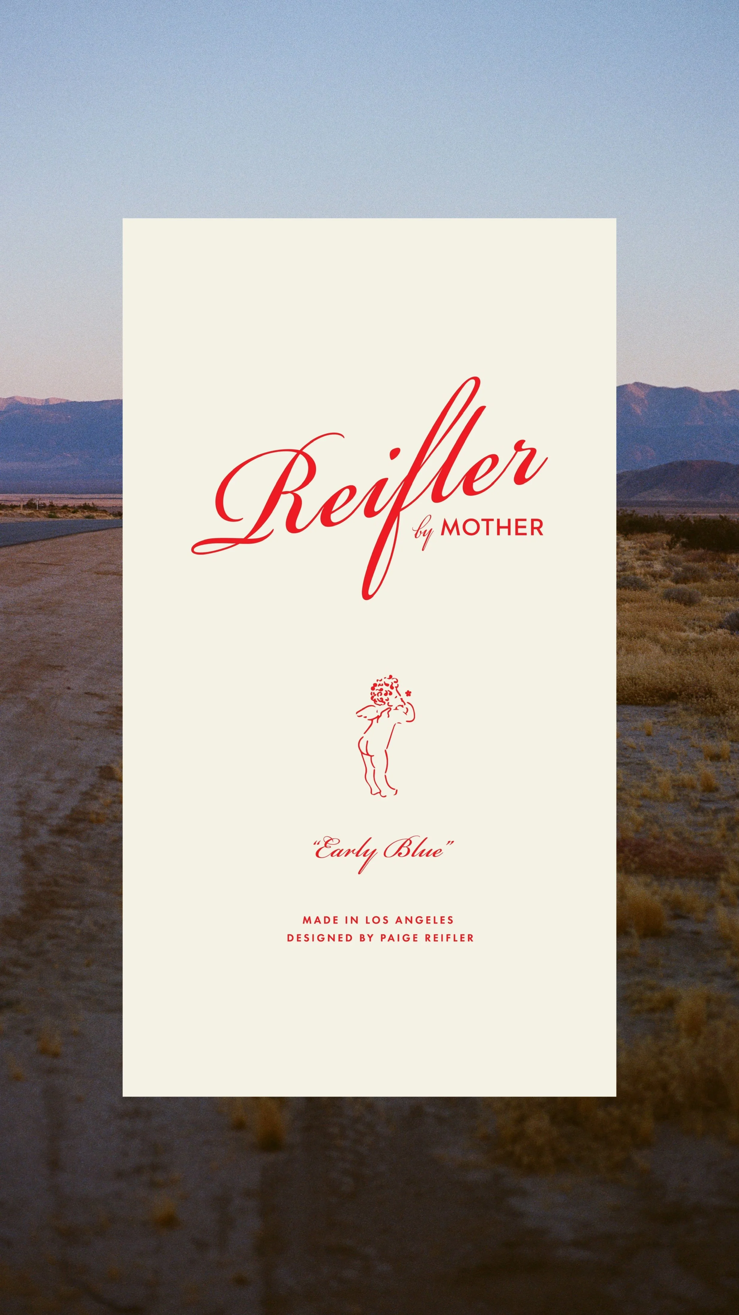
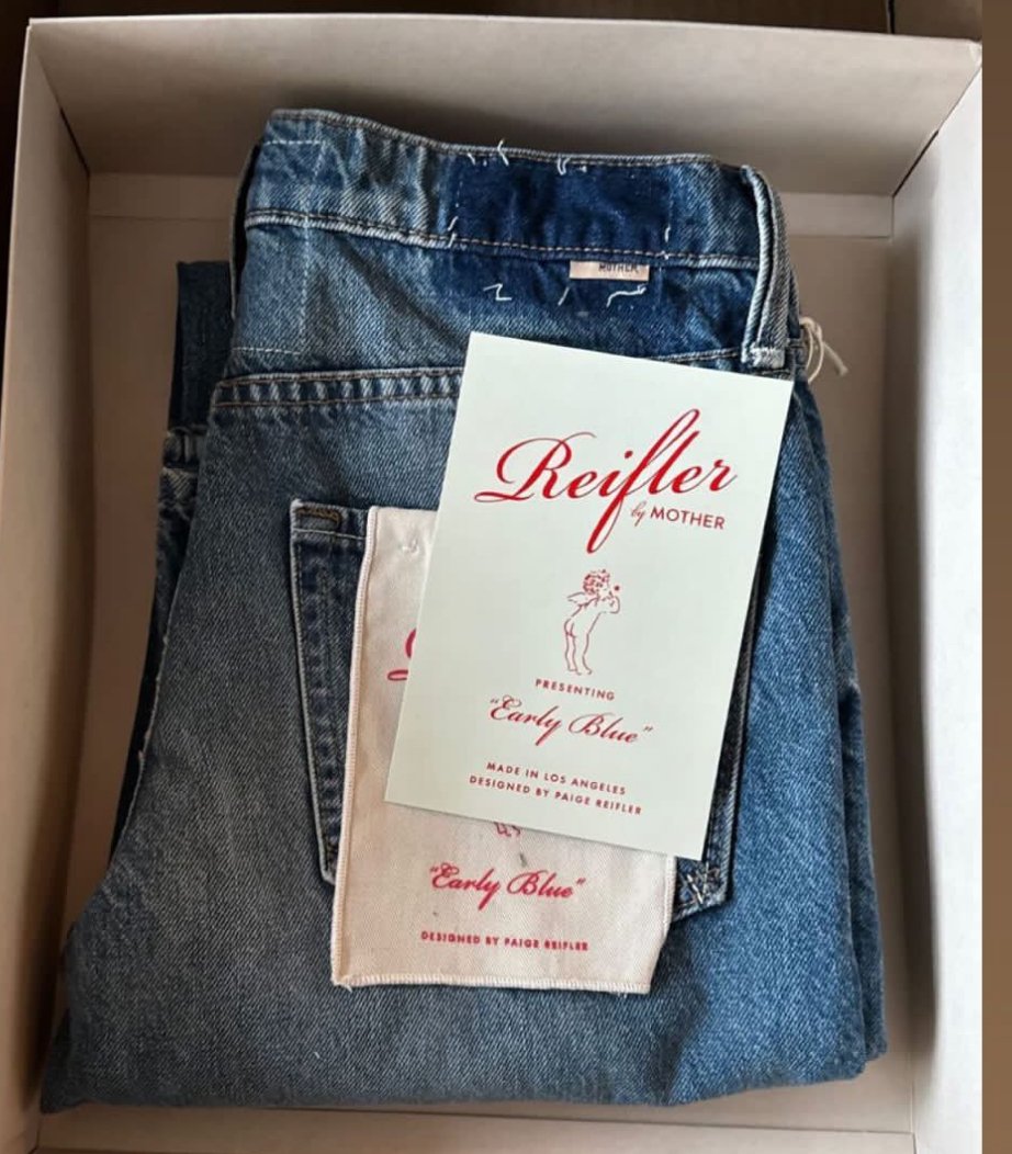
Custom logo inspired by archival denim labels, blending classic Americana with a playful, fashion-forward twist.
Hand-drawn cherubs—a flower in one hand, a moon in the other—symbolized duality and the capsule’s two washes, with a wink to tattoo art and mythology.
Color palette of cherry red, pop yellow, and washed navy brought an unexpected energy to hang tags and packaging.
Packaging system with joker tags and hang tags that nodded to thrift store gems and souvenir graphics.
Campaign and web art direction layered location photography, close crops, and collage-style treatments to evoke a sense of story, place, and personality.